Ascham Intranet
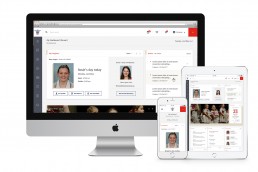
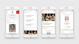
The new Ascham intranet and mobile app are successful, people-centric platforms providing richly-informative and engaging experiences for all users. The intranet provides the ‘single source of truth’ to all involved with the School in a naturally intuitive, beautifully considered and highly effective way, no matter where they are in the world, or what device they may use.
ClientAscham SchoolLinkwww.ascham.nsw.edu.au
Design-led thinking delivers
It is coming to be regarded by the educational industry as new best practice, and an example of how our design-led thinking delivers a digital platform that plays well in the human space.
The outcome echoes the words of the AISNSW ICT Leadership Team:
“[demonstrating]…how technology can act as an agent of meaningful (and perhaps radical) impetus for change in practice, significantly altering the way teachers, students and schools operate, and allowing them to reorganise, reinvent and rebuild pedagogical practices, routines and thinking in ways that reflect the changing technological and sociological climate in which students are learning.” (2018 AISNSW ICT Leadership Conference: National Convention Centre Canberra, 2-4 May 2018).
Read on for how we’ve delivered a successful outcome for the Ascham Hub…
Setting the scene
Scribble & Think has a long and successful partnership with Ascham, working with them since 2007 to help continually enhance their brand voice and quality of communications in order to foster greater engagement with parents, staff and students.
We had originally planned, designed and built the School’s first intranet and so understood the challenges inherent in undertaking any such activity. Our capability in delivering people-centred digital platforms is well-known – coupling this with our understanding of building brand engagement meant we were in a unique position to help the School redefine this critical communication structure.
Understanding the challenge and required outcomes
Although the old intranet served its initial purpose, in the six years since its original launch, much had changed across a number of areas:
- Device use: people are now much more mobile and expect immediate access to anything they need through any device they happen to be using.
- Content management: the School has a wider range of audience-related and personalised content it needs to organise and distribute.
User experience: people expect a much ‘better’ experience – how they interact with digital platforms and get content relevant to them, intuitive navigation of and access to critical content areas. - Technology: the School Fully embeds technology and applications into its communications, which requires considered thought for easy access and integration. Ascham has many more 3rd party connections and more people to connect to more content.
It was clear then that the existing structure had to be redefined if it was to meet these challenges. However, for any new intranet to be truly successful it would also need to engage people at a personal and emotional level – make them feel more connected with the School, deepen the bond with the Ascham brand and drive new behaviour.
For this, it had to be purposeful in its design and efficient in operation; in essence a skilled blend of form and function.
Defining and resolving the problem
Defining needs
Before we undertook any ‘pencil and paper’ activity, or acted on pre-defined conclusions, it was critical we listened to the community: to the School of course, but just as importantly to the wide range of parents, staff and students who would ultimately be using the intranet as their go-to source. What were their issues or frustrations? What did they want? What didn’t they want? How did they want to access information? What was important or nice to have?
Using a range of questions, support stimuli and a suite of methodologies, we built a detailed picture of a ‘future state’ – of what an ideal intranet would offer, how it would best serve people and meet defined business requirements. Such research activity is extremely valuable for us and clients in many planning situations – it can confirm thinking, redefine problems, and serve as a strong framework for evidence-based prototyping. In the case of this project, the research involved many people across different audience groups, and captured empirical evidence that the School found valuable for wider use.
Prototyping a response
Armed with our research findings, we responded with a range of very quick ‘idea iterations’ to those we’d talked with – rough, ‘quick and dirty’ hand sketches and whiteboard doodles that served to validate the input and quickly find an appropriate path.
This method of ‘fast-fail/validate’ allows us to quickly scope thinking, test understanding and define requirements without the time and effort of more complete wireframes or design. It keeps people engaged in functional UX requirements and provides a useful structure to check strengths and weakness early in the process – invaluable in helping to qualify thinking and shape planning.
Shaping the approach
We were now able to add further depth and stretch to the idea, developing our overall vision of the intranet’s extent – planning the information architecture, creating the navigational relationships and developing the sitemap that would enable people to act intuitively to the environment to get what they wanted quickly and easily.
Once agreed, we began developing high fidelity wireframes that would finalise the overall page layouts and content hierarchies across the site. We explored user-specific features including a personalised dashboard, notices and notifications, news and events and a calendar, and demonstrated ways in which the Ascham brand language could be a unifying yet subtle element across desktop, laptop, tablet and mobile.
We set out to redefine the intranet experience, and wherever possible we focused on driving the design structure to respond to how people wanted to act and interact, rather than it simply cater to the existing CMS platform limitations. Ultimately we finalised over 130 page layouts, each answering specific content or information requirements – and all the while focused on providing a personal, user-centric experience.
Developing human-centric design
Having validated the wireframes we could now explore the visual response – how we intended the Ascham brand and our experience in UI design to deliver successful visual engagement for users. Yes, this is a digital platform, but a successful intranet must be useful and of relevance to the people it serves. Above all, they must be engaged with and actually feel drawn to use it.
Rather than fit design into existing limitations and so compromise our intent, we explored new ways to present content and integrate brand language. This pushed the CMS team to new territory and out of their normal development-first mentality, but by demonstrating how design could greatly influence engagement and use, we were able to shift collective thinking.
Through iterations of the concept and further testing we subsequently rolled out the complete design framework, introducing graphical devices to help communicate the range of content types across the intranet: actions, alerts, news, calendar events, invitations, form requests, notifications, articles and so on.
Our role included the overall advisory for the project and the management of the CMS development team, maintaining the push for a people-centric outcome and guiding them in bringing our design intent to life. This included the use of collaborative cloud-based tools to enable a smooth handover.
Delivering a successful outcome
Through design-led thinking and focusing on people and their use of technology, rather than applying a development-led mentality, we have been able to redefine intranet practice and how people engage with this critical platform.
In short, this is a successful, people-centric platform providing a richly-informative and engaging experience for all its users. One that provides a ‘single source of truth’ to all involved with the School in a naturally intuitive, beautifully considered and highly effective way, no matter where they are in the world, or what device they may use.
It is coming to be regarded by the educational industry as new best practice, and an example of how our design-led thinking delivers a digital platform that plays well in the human space. The intranet is being showcased at a number of events through 2018.
Of particular note
In bringing this intranet to life we have led the introduction of a range of new or improved features to the existing CMS platform, taking them into new territory that other educational establishments have long-requested to be available, including:
– Fully-personalised dashboard
– Calendar
– Events
– Notices
– Notifications
These powerful and commercially-appealing functions give users greater and more tailored access to accurate content without compromising design integrity. Users can be completely in touch and remain up to date with the vast range of information and activities available through a uniquely-designed experience.
Bringing a successful Intranet to life
Scribble & Think Communications provides unique and valuable guidance to any organisation wishing to develop a central communications system – of any shape or size, and whether it be a new undertaking or the redefining of an existing platform.
We remain agnostic in our approach to CMS platforms: we are working for you and so our responsibility is to listen to your (and your audiences’) specific challenges and requirements and from these define how we best solve your particular problem. We provide insight into a range of CMS providers and help you decide on an approach to suit your own unique set of requirements.
Organisations can call on our range of skillsets including:
– Problem definition
– Discovery and User research
– Prototyping
– Sitemapping
– Wireframing
– UI Design
– Build and implementation
– Content strategy
– Project management
– Brand advisory
Find out more about how we can deliver a successful outcome for your intranet project.

